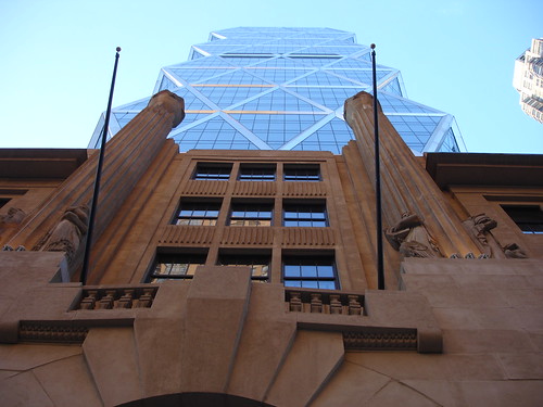
I respect C's opinion that its top is too blunt and might be improved by the addition of ten or twenty more floors before its occurrence.
Here is a sidewalk photo I took Saturday afternoon that attempts to demonstrate the welding of new to old. It probably won’t change the opinions of those who are irritated by it, but if you are as enamoured of it as am I, it will give you a measure of pleasure.

We were delighted to find the lobby open at last, and hurried in, expecting to be told by security that no photos would be allowed. Quite the contrary, we were allowed to gawk and snap to our hearts’ content.
For several months we’ve pressed our faces to the doors, intrigued by a glimpse of a many-tiered Mayanesque glass fountain cut diagonally by an escalator that leads up to a mezzanine level and to the foot of a gigantic beige painting of some sort. Now we are in, and able to see the entire composition.
I am sad to report that the space is an uncomfortable, clumsy, sterile, disjointed, gloomy, inarticulate and static collection of shapes and surfaces. The warehousing of a bland collection of bad ideas.
I imagine a meeting of the “Lobby Design Committee”. They are all distracted by cell phones as Norman Foster says, “I’d like you to picture the jamming of a large cellophane wrapped wedge of wedding cake into a freezer full of Tupperware.” They respond, “Sure. Whatever. Mind the budget and finish it by Christmas.”
The stepped glass pyramid fountain, which should have glowed, seems gluey and in need of Windex. The escalator, which should have soared, seems depressed and in need of Zoloft. The painting, which should have been inspired, is a shroud in need of an image. The entire lobby, which should have been playful, is autistic.
I was rather disappointed.
Here’s the video I made. I defy anyone to watch it from start to stop without falling fast asleep.
If Norman Foster’s goal was to create a restful public space, well bravo and welcome to his sepulcher. (Requiscat in aeternum, Sir Norman. I kept looking for the wall niche that will eventually hold your ashes.)
Finally, since it is my nature to be helpful, I suggest that the giant beige painting at the top of the escalator be replaced with this enduring image of the machine gun toting Patty Hearst as Tanya.


13 comments:
My first thought was, "it'll look better with the water flowing down it" and then you zoomed in and I realised that the water was already flowing - dismal. It looks like someone urinating on a steel security shutter. And the whole building has to get in/out at the speed of a single escalator up/down? And by the time they've ascended/descended I bet they need to pee...
hehehehehhehe I think that Patty Pic is most excellent for a replacement LOL
I can only imagine what that room will be like on a busy morning. It seems loud with 4 people, can you imagine 400.
The poor security gaurd probably encouraged you to take pictures so you'd stay longer and he wouldn't be so alone in what I can only describe as a futuristic prison lobby.
What an astute set of observations! In order to keep up, Paul Goldberger and Nicolai Ouroussof need to expand the means by which they can express themselves. To suggest the substitution of the Patty Hearst image recalls Herbert Muschamp at his most wicked, which was usually off the record. Felicitations!
Grim!
And that fountain resembles nothing so much as a series of ice cubes in search of a cocktail.
Too bad.
Patty painting all the way. Yup.
It really is awful, isn't it.
I do think that that building is one of the most important new projects in this city in years. I ddi not know the lobby was open either.... I think you have inspired a little lunchtime jaunt for me :)
Th exterior of the tower reminds me of The Epcot Center. Very 1980s.
Damn - Patty Hurst. Now thsi is a great find getting a copy of this for future use. Thanks!
I had to watch this erector-set design go up since I live directly across the street. Each morning I pray that when I pull the blinds open, that it will have fallen upon itself and what was once a pretty nice view will have been restored. I'm sure Lord Foster is an intelligent and creative man, but his designs all seem a variation on the diamond-shape theme produced over and over again. The Pacific Rim observation is apt, since there is a Foster building of significant similarity in Hong Kong.
My question is how can they call it a "green building" when they never turn the lights off inside - ever? (yeah, yeah, I heard all about the capture/recycling of rainwater. Blah, blah, blah.)
you've been cheated. unless you work for hearst, no one can experience the beautiful space from the bottom of the escalators - you're just supposed to walk through that, not linger. the real payoff is at the top of the escalator where the old building has been gutted to make that really cool space. if that were open to the public, that would be the best room in new york.
and you're right - that patty painting will most definitely look good at the top of the escalator. real, real big.
Post a Comment